UX & UI Design, Project Management

6 Year Partnership Scaling Skincare WebApp Across 9 Global Variants
Since 2019, my agency partnered with Neutrogena® to revolutionize their skincare experience, starting with a mobile app that evolved into a cutting-edge WebApp in 2022, unlocking broader accessibility by ditching app logins and empowering users worldwide to decode their skin needs and discover tailored products.
Limited app access hindered Neutrogena®'s goal of educating 1M+ users on skin health, prompting a web pivot to boost engagement and product sales. This strategic pivot spawned nine dynamic variants: Neutrogena© US, Neutrogena® Canada, Walmart, Walmart Canada, CVS, CVS Perch (in-store kiosk/physical hardware), Neostrata, India, and Brazil. Each version was finely tuned with localized products, copy, imagery, and translations while maintaining a cohesive, user-centric design core.
As a key contributor across this multi-year collaboration, I've driven UX/UI innovations, from crafting prototypes and leading usability tests to orchestrating project management, developer handoffs, and rigorous QA for seamless launches.
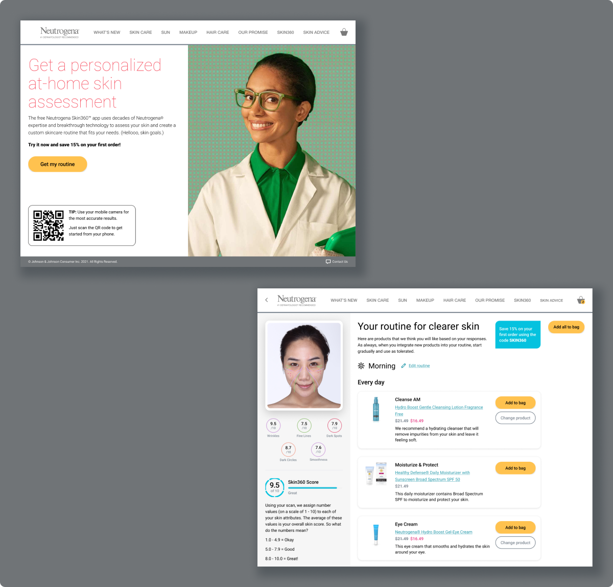
20% Increase in Onboarding Completion Rate
Iterative testing and flow optimizations, such as reducing the number of survey questions, making user sessions more personalized and having the scan feature after survey questions, boosted onboarding completions from 60% to 80% per Google Analytics.
Expansion to 9 Global Variants
App to WebApp migration removed download barriers and expanded reach across devices and screen sizes.
.svg)
.svg)

When migrating the app over to a WebApp, this process involved creating clickable prototypes from design concepts and conducting usability tests with each major overhaul of the WebApp. A/B testing was used to gauge users reactions to different landing page designs. These prototypes informed A/B tests, contributing to smoother onboarding flows.

In addition to identifying any friction within the experience, the purpose of the usability tests were:
I conducted multiple usability tests with 10 users for 60 minutes each, which were recorded via Loom with the users consent. The criteria for testing was that testers must follow a skincare routine or be interested in learning, have an interest in maintaining and improving their skin, and generally purchase new skincare products to address needs. The users recruited were already subscribed to the Neutrogena© newsletter and expressed interest in usability testing. They were selected from that list randomly to avoid bias.
5+ rounds with 50+ users revealed 65% of the testers preferred completing a survey flow before scanning their face, reducing drop off rates.


"The questions feel inclusive enough where they feel tailored to me. I would be more open to completing the survey before scanning my face."
"When I'm scanning my face, it might be easier on my phone. Adding in a QR code on this screen would be helpful to quickly bring me to this screen again."
"The biggest value for me is being presented with different products that fit my skincare needs, but I would also love to know more about the 'why' behind these products."
Based on various instances of usability testing from 2020-2021, we pivoted to a polished WebApp by 2022. Within 2-week sprints, I crafted visuals that made skin education feel effortless, helping users stick with routines and discover products that aligned with their skincare goals.
Throughout the visual design process, the focus was to:
Guided by the style guide, I used bold blues for CTAs, warm yellows for buttons, and goal-specific colors to make navigation intuitive. This setup let users explore ingredients deeply, turning confusion into confidence and ramping up overall engagement, while encouraging a personalized experience, unique to each user.
User tests from 2020-2021 led the way for tweaks like:
Wearing my designer-PM hat, I synced with copywriters and product owners early on CMS essentials across variants, from alt text to local adaptations, such as for French or Portuguese versions. This ensured smoother hand-offs, reducing QA issues for timely releases for each version.
This 6-year ride with Neutrogena taught me the power of adaptive design in a fast-evolving space. Balancing global variants while keeping the core UX intuitive pushed me to champion modular systems early on.
User feedback early on showed me how small tweaks could bridge real-world gaps and drive lasting impact.
As a PM-designer hybrid, I learned early on how cross-team sprints could be used to hone in on my advocacy skills for users.
