UX & UI Design, Project Management
Revitalized NonProfit Site: Streamlined Navigation & Donations for Global Impact
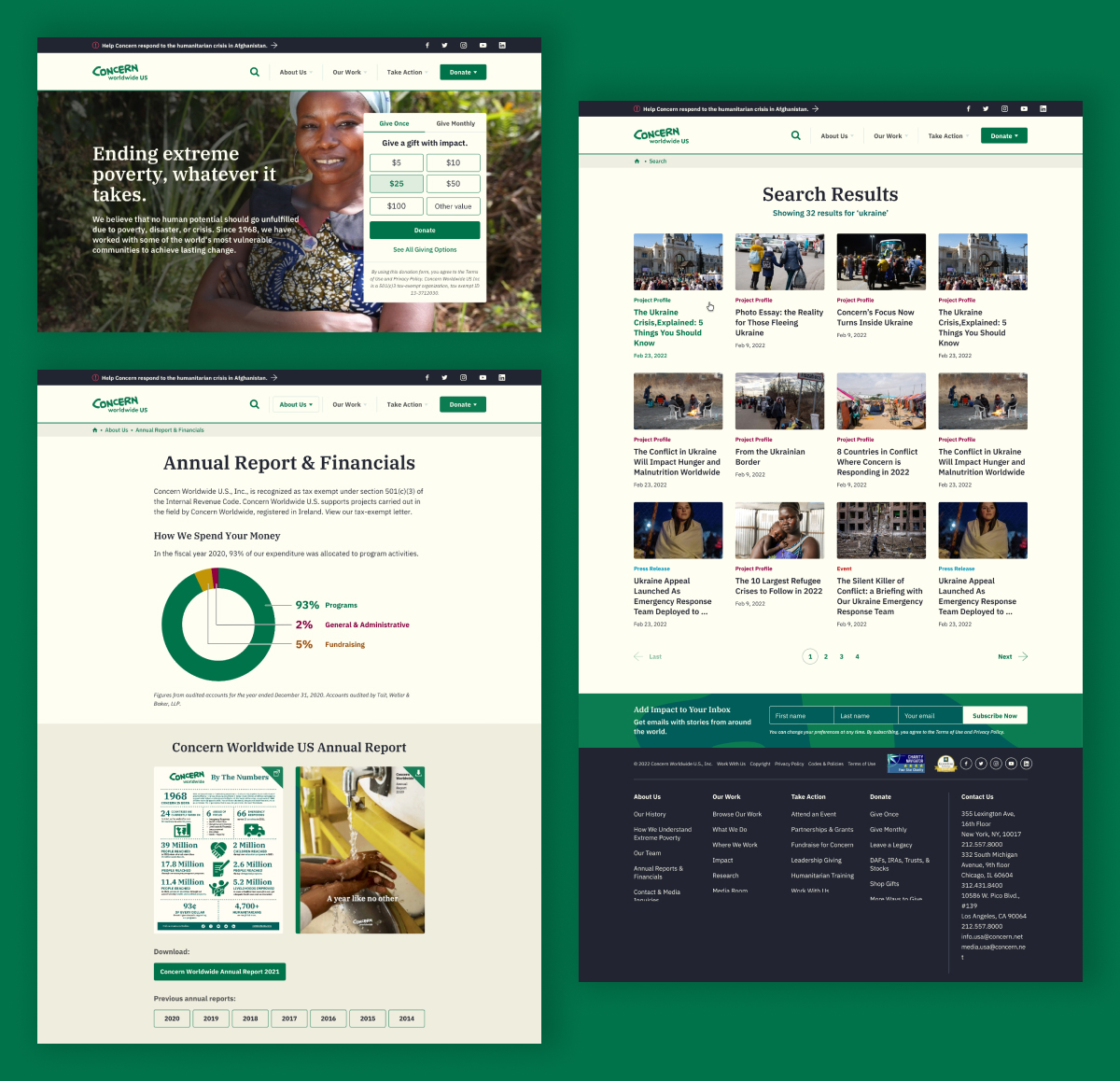
Since 2022, I've worked with Concern Worldwide US, a humanitarian organization working around the world to end extreme poverty. I worked to refresh their bulky website, making navigation smoother, donations easier, and content easier to find throughout the website. As project manager and lead UX/UI designer, I handled everything from sitemaps and prototypes to usability tests, building on our successful 2021 Carbon Footprint Calculator collaboration.
With a massive site full of content and clear usability issues, my goal was to spotlight key features like the donate button and areas they work in without overwhelming users.
.svg)
30% Boost in Donations
Refined user flows based on usability testing feedback streamlined paths to giving.
.svg)
Refined Header Navigation
Optimized headers and visuals reduced search time, giving users faster access to the content they need.

Increase in Engagement & User Retention
Adding interactive elements like maps and widgets increased page interactions per user session.

.svg)

In kickoff talks with Concern, they flagged minimal traffic to their donate feature and wanted that to be a primary focus for the new website. They also mentioned that due to the fact that they have such a content-heavy website, users were struggling to understand the structure of the website navigation and find what they were looking for. As a designer and PM lead, I used this valuable feedback to my advantage in the designs, spiking user engagement post-launch.
I created a sitemap to clearly outline the proposed structure of the website and created a clickable prototype to use for usability testing.

The goals of the usability test were to understand:
With a clickable prototype, I conducted usability tests with 10 users for 45-60 minutes each, recorded via Loom with the users consent. These tests with donors and casual users helped to fuel UI design refinements and reduced the time it takes users to find information throughout the site or complete a donation.


"For the donation option, I like how option A clearly lays out the donate options. I don't think that option B has a clear layout. have a harder time focusing on what I need to do."
"It's important for me to not only know how to donate easily, but to also see where the money goes. I often donate to organizations but I don't ever donate to a corporation that doesn't explain what they're doing with the money."
"I like seeing the map within the work section of the navigation. It helps me to understand what this section might be about."

Based on feedback from the usability testing and understanding Concern's goals for their website, I set out to create visual design aesthetics that:
Using Concern's style guide, I spotlighted their "Concern green" for CTAs to evoke urgency and hope, paired with soft "biscuit" for backgrounds to support a welcoming vibe. I played around with pieces of the logo to create interesting background patterns and overlays. For the overlay text on the images, a dark blur effect was used to make the text readable throughout.
IBM Plex Serif was used for headings and stats to help establish hierarchy, while IBM Plex Sans was used for the body text to help create a rhythm that made dense information more digestible.
User tests led the way for tweaks like:
As the lead designer and PM on this project, I spearheaded seamless cross-team collaboration, aligning developers, copywriters, project managers, marketing executives, and stakeholders to craft a site that surpassed humanitarian goals, showcasing my strategic prowess in navigating complex redesigns with efficiency and vision.
Our partnership ignited in 2021 after I designed their Carbon Footprint Calculator and exploded into 5 new initiatives through 2025. Concern's team praised my approach for transforming usability insights into tangible victories, earning their repeat business as a nod to my ability to deliver high-impact designs that built lasting trust and success for their team.
This project drove home the importance of future-proofing designs. Nailing the initial redesign based on their vision was a win, but when a new team stepped in a year post-launch and hit CMS rigidity walls, it spotlighted the need for flexibility in areas we didn't anticipate. I jumped in to advocate for modular updates, working closely with our developers to adhere to their evolving content needs without a full overhaul. This not only kept the site humming but boosted their operational efficiency, turning a potential snag into a stronger partnership.
Donation metric provided by client.